안녕하세요? 이번 글은 시리즈 글의 일부로 Google Earth Engine과 geemap을 이용한 종 분포 모델링(SDM: Species Distribution Modeling) 구현 방법을 소개해 보겠습니다. 이 글의 내용은 스미소니언 보전생물연구소 연구진 분들이 제공한 JavaScript 소스코드를 Python으로 변환하여 수정, 보완한 것입니다.
Crego, R. D., Stabach, J. A., & Connette, G. (2022). Implementation of species distribution models in Google Earth Engine. Diversity and Distributions, 28, 904–916. https://doi.org/10.1111/ddi.13491
사례 연구 1: 출현-전용 데이터를 이용한 팔색조(Pitta nympha) 서식지 적합성 및 예측 분포 모델링
Google Earth Engine과 geemap을 이용한 종 분포 모델링(SDM) 구현을 위한 사례 연구로 팔색조(Pitta nympha) 데이터를 이용해 보겠습니다. GBIF에서 제공하는 생물종 분포 데이터(https://foss4g.tistory.com/1907)에서 팔색조의 출현-전용 데이터를 얻었습니다. 출현 전용 데이터는 수집기간이나 좌표 불확실성(예: 낮은 위치 정확도, 건물이나 수역 위에 위치) 등을 기준으로 정제가 필요합니다.
일단, ee와 geemap과 함께 필요한 모듈을 가져오고, Earth Engine을 초기화하는 작업을 수행합니다.
import ee
import geemap

import geopandas as gpd
import matplotlib.pyplot as plt
import numpy as np
# Earth Engine 인증
# ee.Authenticate()
# Earth Engine 초기화
ee.Initialize()geemap 라이브러리를 사용하여 빈 지도 객체를 생성합니다.
# geemap 빈 지도 객체 생성
Map = geemap.Map()
1. 종 출현 데이터 추가
팔색조의 출현-전용 데이터로부터 지정한 열("species", "year", "month", "geometry")의 데이터를 읽어들여 'gdf'라는 데이터프레임에 저장합니다.
# 입력 파일 경로
input_gpkg_file = 'pitta_nympha_data.gpkg'

# GeoPackage 파일 로드
gdf = gpd.read_file(input_gpkg_file)[["species", "year", "month", "geometry"]]
수집기간을 기준으로 데이터 분포를 확인하고자 연도별과 월별 그래프를 그려봅니다. 다른 데이터와 동떨어진 1995년, 8월, 9월 데이터 3건은 출현-전용 데이터에서 제외하도록 하겠습니다. 이로써 팔색조 수집-전용 데이터는 2012년부터 2023년까지 기간 중 5월부터 7월까지 관측된 좌표만을 사용합니다.
def plot_data_distribution(gdf):

    # 연도별 데이터 분포 그래프 (왼쪽)
    plt.figure(figsize=(12, 4))
    plt.subplot(1, 2, 1)
    year_counts = gdf['year'].value_counts().sort_index()
    plt.bar(year_counts.index, year_counts.values)
    plt.xlabel('Year')
    plt.ylabel('Count')
    plt.title('Yearly Data Distribution')

    # 막대 그래프 안에 데이터 개수 표시
    for i, count in enumerate(year_counts.values):
        plt.text(year_counts.index[i], count, str(count), ha='center', va='bottom')

    # 월별 데이터 분포 그래프 (오른쪽)
    plt.subplot(1, 2, 2)
    month_counts = gdf['month'].value_counts().sort_index()
    plt.bar(month_counts.index, month_counts.values)
    plt.xlabel('Month')
    plt.ylabel('Count')
    plt.title('Monthly Data Distribution')

    # 막대 그래프 안에 데이터 개수 표시
    for i, count in enumerate(month_counts.values):
        plt.text(month_counts.index[i], count, str(count), ha='center', va='bottom')

    # x 축의 눈금을 정수 형식으로 설정
    plt.xticks(month_counts.index, map(int, month_counts.index))

    # 그래프 출력
    plt.tight_layout()
    plt.savefig('data_distribution_plot.png')
    plt.show()

plot_data_distribution(gdf)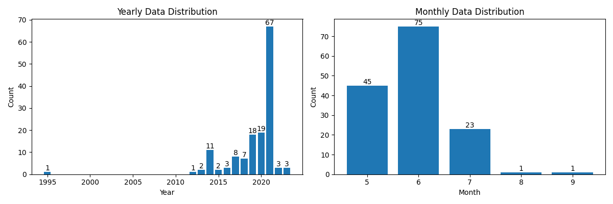
# 연도와 월 기반으로 필터링
filtered_gdf = gdf[
    (~gdf['year'].eq(1995)) &
    (~gdf['month'].between(8, 9))
]

plot_data_distribution(filtered_gdf)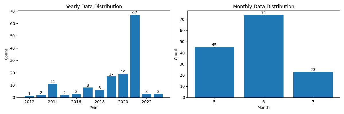
def plot_heatmap_from_gdf(gdf):
    # 필요한 통계 계산
    statistics = gdf.groupby(["month", "year"]).size().unstack(fill_value=0)

    # 히트맵으로 통계 시각화
    plt.figure(figsize=(8, 2))
    heatmap = plt.imshow(statistics.values, cmap="YlOrBr", origin="upper", aspect="auto")

    # 각 픽셀 위에 수치 표시
    for i in range(len(statistics.index)):
        for j in range(len(statistics.columns)):
            plt.text(j, i, statistics.values[i, j], ha="center", va="center", color="black")

    plt.colorbar(heatmap, label="Count")
    plt.title("Monthly Species Count by Year")
    plt.xlabel("Year")
    plt.ylabel("Month")
    plt.xticks(range(len(statistics.columns)), statistics.columns)
    plt.yticks(range(len(statistics.index)), statistics.index)
    plt.tight_layout()
    plt.savefig('heatmap_plot.png')
    plt.show()

# 히트맵 그래프 출력 함수 호출
plot_heatmap_from_gdf(filtered_gdf)

# 통계 테이블 출력
print(filtered_gdf.groupby(["month", "year"]).size().unstack(fill_value=0))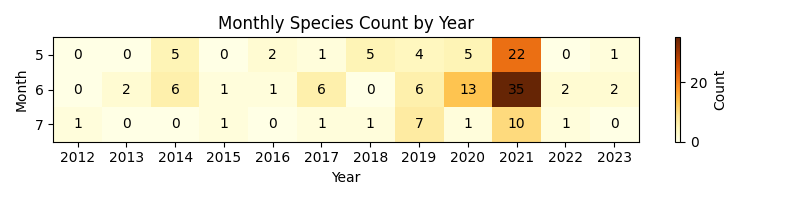
year   2012  2013  2014  2015  2016  2017  2018  2019  2020  2021  2022  2023
month
5         0     0     5     0     2     1     5     4     5    22     0     1
6         0     2     6     1     1     6     0     6    13    35     2     2
7         1     0     0     1     0     1     1     7     1    10     1     0
필터링된 GeoDataFrame을 Shapefile 형식으로 저장한 다음, 다시 Earth Engine의 데이터 형식으로 변환합니다.
# 출력 파일 경로
output_shapefile = 'pitta_nympha_data.shp'

# shapefile로 저장
filtered_gdf.to_file(output_shapefile)

# 출현(presence) 원시 데이터 추가
data_raw = geemap.shp_to_ee(output_shapefile)
출현-전용 데이터에서는 지리적 샘플링 편향(geographic sampling bias)의 잠재적 영향을 제한해야 합니다. 이를 위해 작업할 공간 해상도를 기준으로 각 픽셀 내에서 출현 기록 하나만 무작위 선택하면 모델의 예측이 특정 지역에 치우치는 것을 방지할 수 있습니다. 여기서는 47개 지점이 제외되었습니다.
# 작업할 공간 해상도 설정(m)
GrainSize = 1000

def remove_duplicates(data, GrainSize):
    # 선택한 공간 해상도(1km)에서 픽셀 당 출현 기록 하나만 무작위 선택
    random_raster = ee.Image.random().reproject('EPSG:4326', None, GrainSize)
    rand_point_vals = random_raster.sampleRegions(collection=ee.FeatureCollection(data), scale=10, geometries=True)
    return rand_point_vals.distinct('random')

Data = remove_duplicates(data_raw, GrainSize)
print('Original data size:', data_raw.size().getInfo())
print('Final data size:', Data.size().getInfo())Original data size: 142
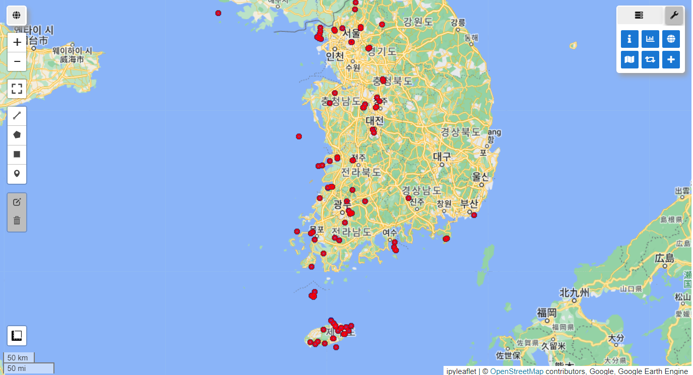
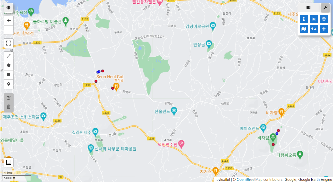
Final data size: 95지리적 샘플링 편향의 전처리 전(파란색)과 후(빨간색)를 가시화한 결과입니다.
vis_params = {'color': 'blue'}
Map.addLayer(data_raw, vis_params, 'Original data')
Map.centerObject(data_raw.geometry(), 7)

vis_params = {'color': 'red'}
Map.addLayer(Data, vis_params, 'Final data')
Map.centerObject(Data.geometry(), 7)

Map